Research report originally posted here
25 Jun 2018
In the last few days, we’ve experienced a massive rout in the cryptocurrency market.
Skeptics are laughing, traders are fleeing , and even HODLers are worried that the sky is going to fall.
The home page of coinmarketcap is awash in a sea of red. And as if by some strange design, every 7 day price graph looks like they’ve been lazily copy pasted from coin to coin.
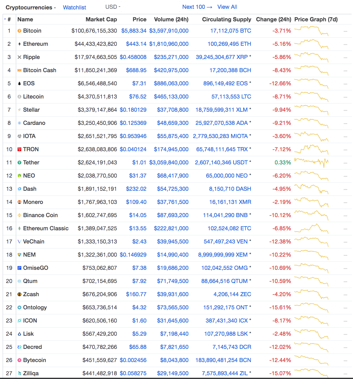
The market has seen better days.
In times like these we have to wonder:
- Are all cryptocurrencies correlated with the market?
- Are there any coins that are resistant to large market movements?
This topic has long plagued my curiosity. So, I’m going to analyze the historical data and attempt to answer the following questions:
- How many coins are strongly correlated with the overall market?
- How many coins are strongly correlated with Bitcoin?
- What are the coins that are the least correlated to the overall market?
- What are the coins that are the least correlated to Bitcoin?
- How do the top 20 coins by market cap correlate with each other?
Looking at the Data
We’re going to analyze 2 years of historical data from Coinmarketcap (CMC) from June 22, 2016 to June 20, 2018.
There can be quite a large spread in price between exchanges. This is why we’re going to use CMC. CMC derives price by taking the volume weighted average of all prices across every exchange.
Criteria & Focus
- We’re only going to look at coins on CMC that have at least 120 days of historical data.
- We’re only going to focus on the top 200 coins by market capitalization. I want to focus on medium to large cap coins because they have more trading volume and liquidity.
Let’s Begin
The first thing we’re going to do is to fetch the data. CMC has an API for current data, but none for historical data.
We would have to scrape this data ourselves from CMC’s historical snapshots, but fortunately awesome people have already build scrapers to do that.
We can use coinmarketcappy to get historical data on the total market cap and we can use cryptomarketcap-historical-prices to get historical data for individual coins.
1. How many coins are strongly correlated with the market?
Before we dive into the results, let’s run through an example of how to calculate correlation between BTC and the market.
We don’t want to double count BTC’s market capitalization, so we will subtract BTC’s market cap from the total market cap.
Rest of the Market Cap = Total Market Cap — Individual Market cap
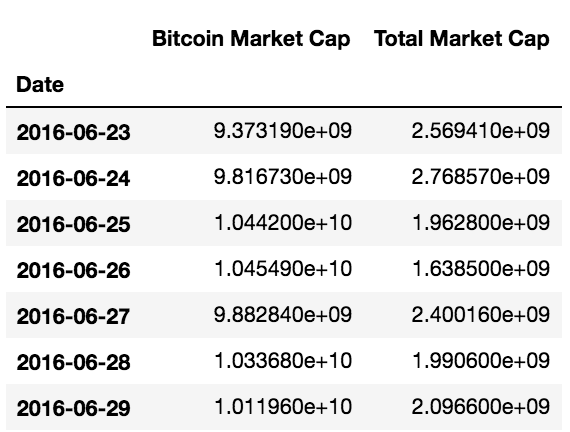
The total market cap has been adjusted by subtracting BTC’s market cap to avoid double counting.
Once we have data for BTC’s market cap and the overall market, we can calculate the Pearson correlation coefficient between the two over the entire time period.
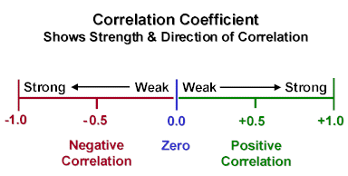
A correlation coefficient of +1 implies that the pair will always move in the same direction. Conversely, a correlation coefficient of -1 implies that the pair will always move in the opposite direction. If the correlation coefficient is 0, this suggests there is no observable linear relationship between the two.
Here’s the correlation matrix between BTC & the overall market.
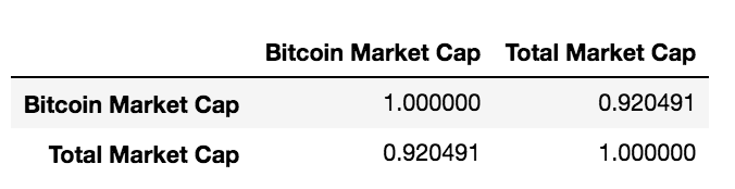
We get 0.92 as the correlation coefficient between BTC and the total market
All we have to do is repeat this process for each of the top 200 coins. Then we can plot a histogram and density plot with all of the correlation coefficients.
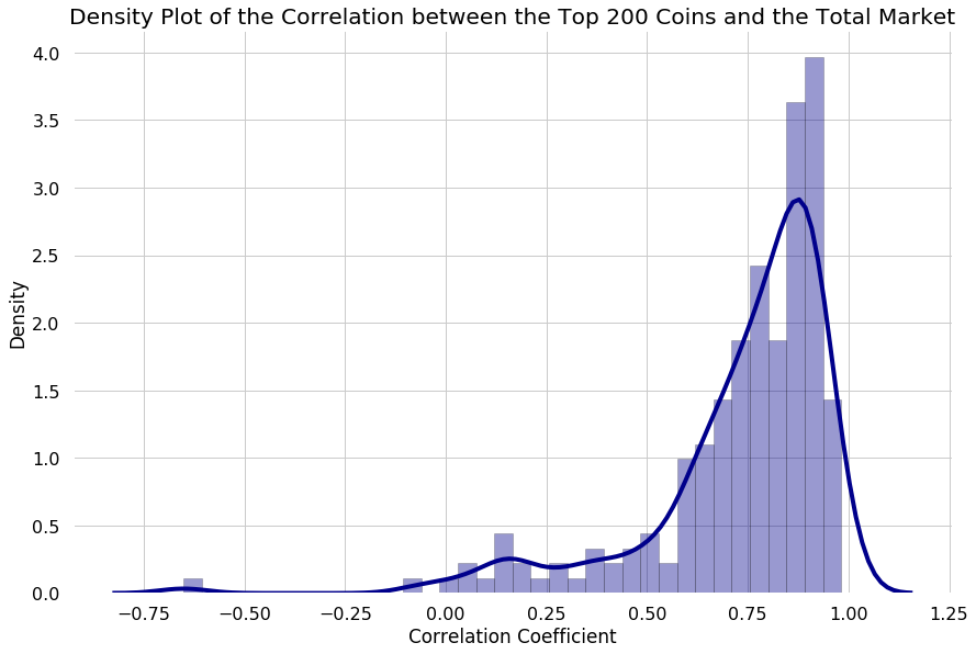
The area under the curve of a density function represents the probability of getting a value between a range of x values. If the width for a particular section is tiny, the height can be much higher than 1 without violating any the rules of probability. I.e. 4 * 0.01 is just 4%.
From a glance, our density plot indicates that most coins in the top 200 are highly correlated with the market.
- 75% of the top 200 coins have a correlation of 0.67 or higher.
- 50% of the top 200 coins have a correlation of 0.80 or higher.
These numbers suggest that when the market goes up, most coins are also likely to go up. And when the market goes down, they are bound to follow.
2. How many coins are strongly correlated with Bitcoin?
Bitcoin has long reigned as the king of the cryptocurrencies. Although its market dominance is not what it used to be, many people are under the impression that most cryptocurrencies follow BTC’s price movements.
Let’s explore if that’s true.
To calculate correlation between each of the top 200 cryptocurrencies and Bitcoin, we’re going to take the same approach we used earlier.
Let’s run through an example for Ethereum.
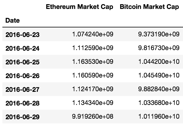
Calculating the correlation between ETH market cap vs. BTC market cap
Once we have the historical data for the market cap of both BTC and ETH, we can compute the correlation of the two coins across the entire time period.
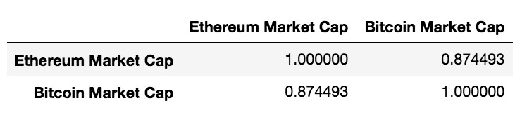
We get 0.87 as the correlation coefficient between BTC and ETH
After running this calculation for each of the top 200 coins by market cap, we can create our density plot:
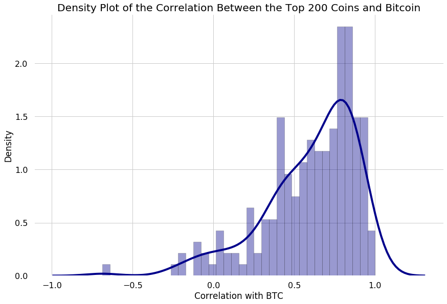
The area under the curve of a density function represents the probability of getting a value between a range of x values. If the width for a particular section is tiny, the height can be much higher than 1 without violating any of the rules of probability. I.e. 4 * 0.01 is just 4%.
The belief that most coins are correlated with BTC seems to hold true. Most of the top 200 coins by market cap are correlated with BTC.
- 75% of the coins in the top 200 have a correlation of 0.44 or higher.
- 50% of the coins in the top 200 have a correlation of 0.67 or higher.
However, it does seem that the correlations between the top 200 coins and BTC are weaker than the correlations between the top 200 coins and the overall market.
My initial thought was that as BTC dominance falls, we would see a lower correlation between BTC and the total market
Strangely, it seems that this is not true. When bitcoin as a % of the total market cap went down in early 2017, the correlation between BTC and the overall market didn’t follow.
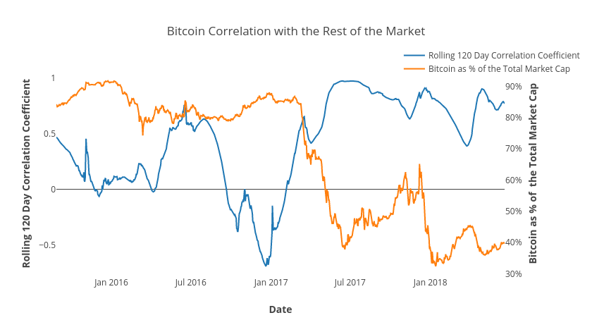
A rolling window of 120 means that on any given date, the correlation co-efficient was calculated using the last 120 day’s data. A rolling window is used to smoothen out volatility in order to make graphs more legible.
3. What are the coins in the top 200 by market cap that are the least correlated with the overall market?
We can simply get this data by sorting the correlations we previously calculated in ascending order.
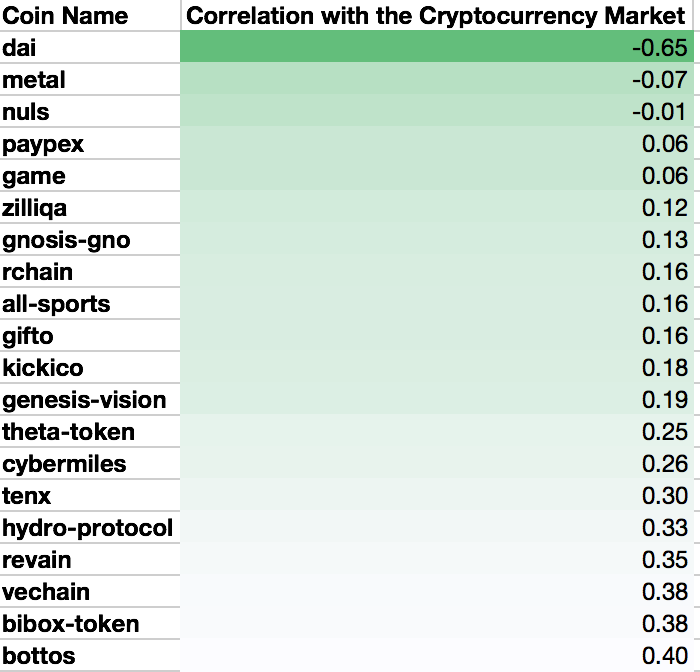
Top 20 coins with the lowest correlations to overall market
There are very few coins that are negatively correlated with the overall market. I’m not surprised to see MakerDAO’s Dai at the top of the list. Dai is a stablecoin after all.
4. What are the coins that are in the top 200 by market cap that are the least correlated to Bitcoin?

Top 20 coins with the lowest correlations to BTC
There are a few more coins that are negatively correlated with BTC. Interestingly enough, bitcoin cash and bitcoin’s other forks are not high on this list.
5. How are the coins in the top 20 by market cap correlated to each other?
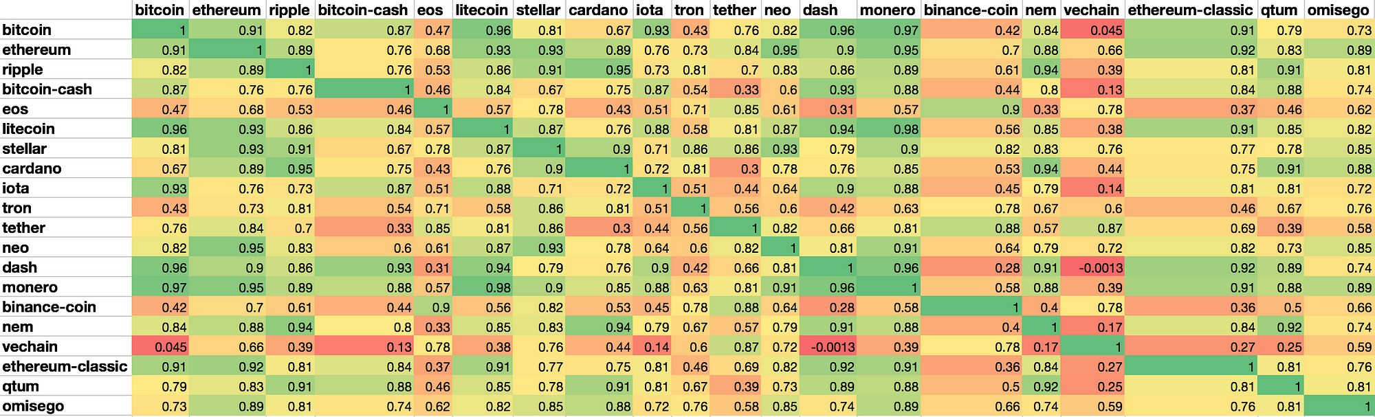
Harry Markowitz, the father of modern portfolio theory, postulated that the most important aspect of risk to consider is an asset’s contribution to the overall risk of the portfolio, rather than the risk of the asset in isolation.
This means that by including assets with low or negative correlation in your portfolio, you can reduce the overall variance and therefore reduce the risk of your portfolio.
Across the top 20, we do see instances where certain coins have low correlations with each other e.g. BTC & Vechain, Dash & Vechain, Ethereum-Classic & NEM.
Having combinations of coins with low correlation is why diversification can significantly reduce risk.
Limitations of Pearson’s Correlation Coefficient
We did some pretty nifty data analysis, but I do want to address some limitations with Pearson’s correlation coefficient.
Pearson’s Correlation Coefficient Assumes a Linear Relationship
Linear relationships are easy to understand and easy to model. However, many relationships between two assets is non-linear. It can be polynomial, exponential, etc. In these cases, Pearson’s correlation coefficient, unnecessarily simplifies the relationship.
Correlation changes over time
The Pearson’s correlation coefficient renders a single number for the entire time period. It does not account for changes over time.
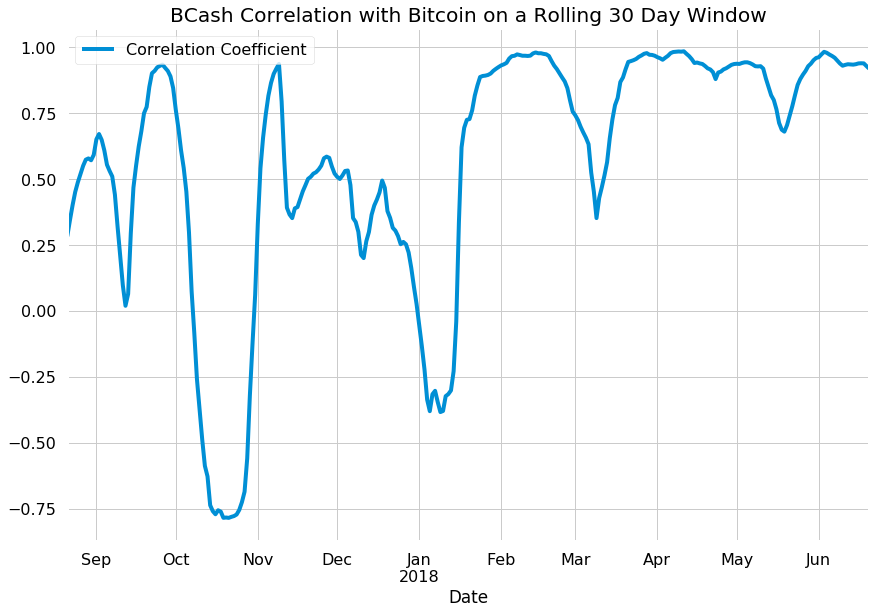
I want to show this chart as an example of how correlations can change over time. Just because something was correlated a certain way in the past, does not mean the relationship will hold in the future. The 30-day rolling correlation for many coins looks like this, a series of ups and downs.
To me, it means that we are still in an early industry, where the movements between cryptocurrencies have not settled. So while looking at this data is interesting and can tell us about the past, take it with a grain of salt when moving towards the future.